Line Graphs
1 2021-06-21T15:33:50-04:00 Benjamin Steinig 74775bc5c03628537e0192f4b5deec6811d610f6 7 1 Line graphs are used to display quantitative values over a continuous interval or time period. A line graph is most frequently used to show trends and analyze how the data has changed over time, but time does not have to be one of the variables. The are also good for showing how long positive or negative trends last. William Playfair's stacked line graph (with two categories and therefore two lines) shown here is from the 1786 Commercial and Political Atlas was innovative in that it showed the importance of the relationship between the lines too. plain 2021-06-21T15:33:50-04:00 Benjamin Steinig 74775bc5c03628537e0192f4b5deec6811d610f6This page has paths:
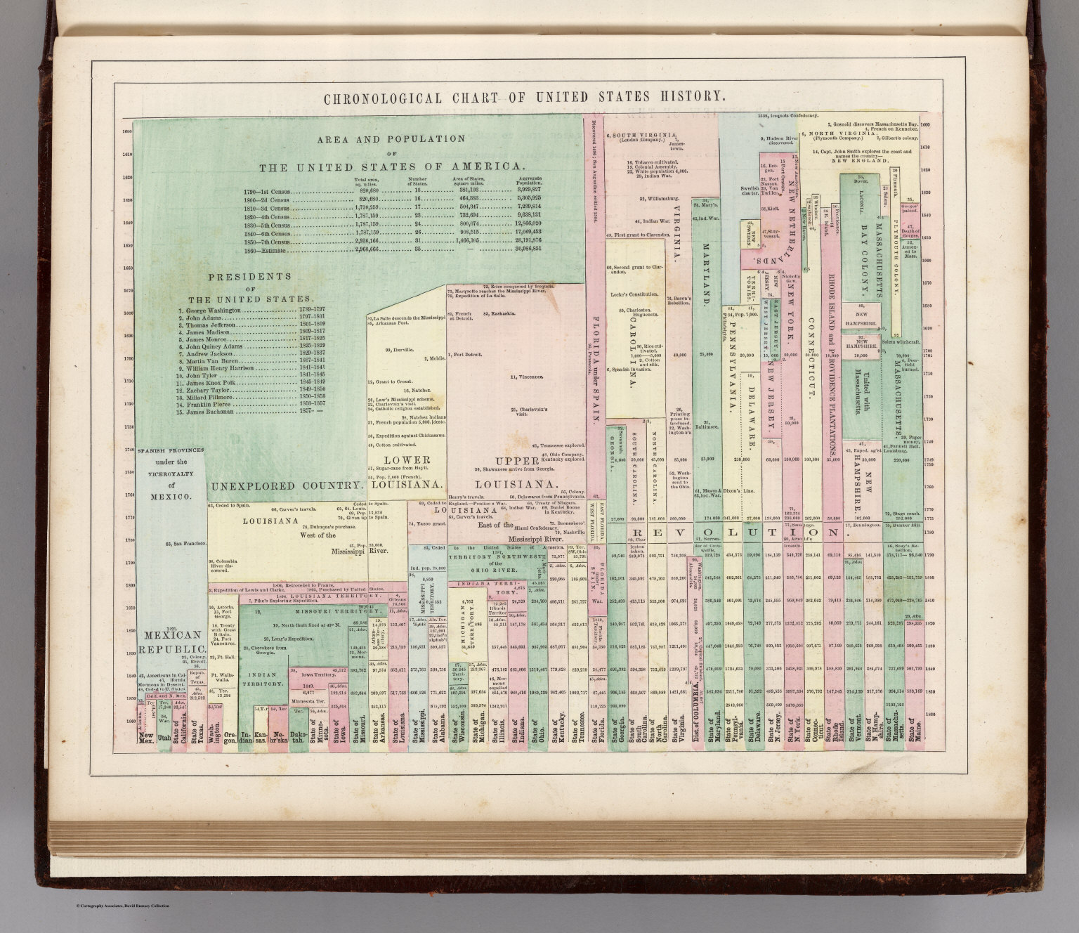
- 1 2021-06-21T15:33:49-04:00 Benjamin Steinig 74775bc5c03628537e0192f4b5deec6811d610f6 Temporal Data Visualizations Benjamin Steinig 1 Temporal data visualizations help us answer "when" questions. They allow us to visualize when events occurred and how they are temporally related to when other events occurred. They help us understand the sequence and duration of events, how events overlapped or were separated in time, and how things may have changed or remained continuous over time. plain 2021-06-21T15:33:49-04:00 Benjamin Steinig 74775bc5c03628537e0192f4b5deec6811d610f6
- 1 2021-06-21T15:33:49-04:00 Benjamin Steinig 74775bc5c03628537e0192f4b5deec6811d610f6 Categorical or Topical Data Visualizations Benjamin Steinig 1 Categorical or topical data visualizations help us answer what or how questions. They are useful for comparisons, distributions, patterns, proportions, and relationships. plain 2021-06-21T15:33:49-04:00 Benjamin Steinig 74775bc5c03628537e0192f4b5deec6811d610f6