Bubble Charts
1 2021-06-21T15:33:50-04:00 Benjamin Steinig 74775bc5c03628537e0192f4b5deec6811d610f6 7 1 A bubble chart is a multi-variable graph that is a cross between a scatterplot and a proportional area chart. Bubble charts use a Cartesian coordinate system to plot points along a grid where the X and Y axis are separate variables. Each point is assigned a label or category. Each plotted point then represents a third variable by the area of its circle. Colors can also be used to distinguish between categories or used to represent an additional data variable. Time can be shown either by having it as a variable on one of the axis or by animating the data variables changing over time. Hans Rosling made the bubble chart famous through his website Gapminder. plain 2021-06-21T15:33:50-04:00 Benjamin Steinig 74775bc5c03628537e0192f4b5deec6811d610f6This page has paths:
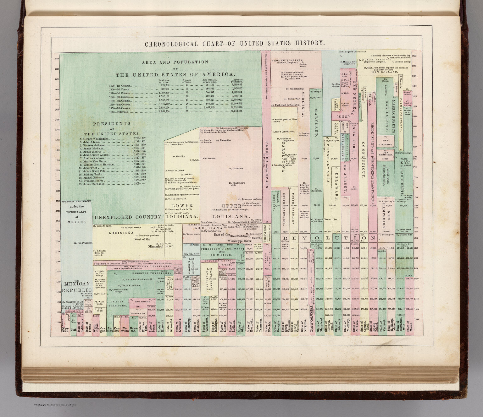
- 1 2021-06-21T15:33:49-04:00 Benjamin Steinig 74775bc5c03628537e0192f4b5deec6811d610f6 Temporal Data Visualizations Benjamin Steinig 1 Temporal data visualizations help us answer "when" questions. They allow us to visualize when events occurred and how they are temporally related to when other events occurred. They help us understand the sequence and duration of events, how events overlapped or were separated in time, and how things may have changed or remained continuous over time. plain 2021-06-21T15:33:49-04:00 Benjamin Steinig 74775bc5c03628537e0192f4b5deec6811d610f6
- 1 2021-06-21T15:33:49-04:00 Benjamin Steinig 74775bc5c03628537e0192f4b5deec6811d610f6 Categorical or Topical Data Visualizations Benjamin Steinig 1 Categorical or topical data visualizations help us answer what or how questions. They are useful for comparisons, distributions, patterns, proportions, and relationships. plain 2021-06-21T15:33:49-04:00 Benjamin Steinig 74775bc5c03628537e0192f4b5deec6811d610f6